This is not your typical how-to-do-something guide flooded with empty promises and pricey products.
Instead, I will share with you valuable and actionable tips that work.
I’ve used this technique on my blog since the start, so they never get old.
Hope you like it! 🙂
👉🏻 Sign up with this link to get a free look at your site

#1 Designing the Header
The header of a blog is the first section we find common for the entire site.

So, a good design is very important to have with it. Nobody will consider going further down if your header looks ugly and hard to navigate.
To be a great design, a website header (at least) should accomplish the following 2 criteria:
- It should look minimal and responsive. Or your readers will get exhausted.
- Must consist only of the necessary menu items. Otherwise, people get confused and abandon the site for a better alternative.

The following one is a good design.

- There is no confusion about what to choose.
- Other sub-categories have been listed as drop-downs.

- Less frequent categories are moved down to the footer section.

Now you know the most basic things a better header should have.
But, just having those two does not guarantee a header to be a great design.
Let me show you 4 ways how to do this.
Tip 1: Separate Logo & Menu clearly
The header should be the last place to look like junk.

Separate the menus and the logo with a white space.

Now it is very clear to see what is what and the viewers will not have a hard time looking at the header — trying to figure it out.
How to do this in WordPress:
WordPress has made this feature default. It will automatically adjust the space between the logo and the menus.
How to do this in a hand-coded blog:
This coding part is super easy. Create two div tags inside the <header></header> (div B & div C).
- Give div A the CSS property flex
- Justify it as “Space-between”

Here’s the code:
<div classname="A">
  <div classname-"B">{ LOGO }</div>
  <div classname-"C">
    <a href="/Home">Home</a>
    <a href="/menu2">Menu 2</a>
    <a href="/menu3">Menu 3</a>
  </div>
</div>
<style>
  .A {
    display: flex;
    justify-content: space-between;
  }
</style>
Edit this code as you need. The core is the same.
Tip 2: Add the correct amount of padding
Another important fact you need to look at is the space itself the header has.

- Use an equal amount of padding for the top and bottom of the div containing the header.
- What about no padding? (don’t even think about doing that).
How to do this on WordPress:
No matter what theme you are using, the process will be quite the same.

- Login to your wp-admin account
- Go to Customize> Header > General Settings
- Add padding as you feel all right
How to do this in a hand-coded blog:
Similar to the CSS we added before, introduce a new padding attribute to the div A.

.div A {
  padding-top: 26px; //give a value as it fits.
  padding-bottom: 26px;
}
or, you can do this in a single line:
.div A {
  padding-top: 26px 0px; (top-and-bottom left-right)
}
Now it’s time to go inside and design the Navbar & the logo sections.

Tip 3: Choosing the Correct Typography
The font and the other settings are equally important as the other design considerations we talked about earlier.
- Font style
- Color
- Weight
Each of these changes the meaning it defines. We should choose the combination that best fits the website theme.
Read this guide to understand the typography.

When choosing a typography for the header menu bar, it is important to choose something that stands out.
- Semi-bold weight looks like a good choice.
- Lower the letter spacing when you are going with higher weights. It will look beautiful that way.
How to change menu typography in WordPress:
The typography of the menu items can be customized by going to the Main menu settings.
- Customize > Typography > Main Menu

Note:
These item names could vary with the theme you are using. But the process is all the same. You can find them easily.
How to change menu typography on the Coded website:
Remember, You can’t just give the CSS properties directly to the <a> tag. It will change all the links on your entire website or blog.
This has a very simple CSS trick to avoid that.

- See, these menu items are inside the <navbar> tag. So, we can just give the CSS properties to the <a> tags inside the <navbar>.
- Here’s how you do it.
// This <navbar></navbar> is a tag. Not a Classname.
navbar a {
  font-family: Poppins;
  color: "#242424";
  font-weight: 500; //Semi-bold
  text-decoration: none; //To remove the ugly link css.
}
- Give equal padding between the menu items.

Giving equal padding in WordPress:
- Go to Customize > Header > Menu
- Add padding as it fits

Giving equal padding in a coded website:
navbar a {
padding: 0px 10px; //To make equal padding
}
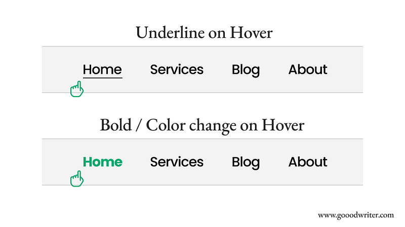
Hover effect for Navbar items:
Additionally, by adding a hover effect to the navbar, you can give the visitors a better user experience (UX).

- By underlining the hovered or selected (active) menu item.
- Giving more weight or changing the color when hovering.
How to do this in WordPress:
As always, log into your wp-admin account and open the customization panel.
- Next, click on Header > Menu
- Choose a link effect
- Give a color to the link effect

How to do this on a coded website:
Remember how we stylize the navbar? You just need to add some additional CSS to it.
- What we need is a hover effect.
- First, define the animation on the element you need. Here, it’s an <a> tag.
- Then, add that animation to the hover effect.
That’s it. It is that simple.

// This is what already exists.
navbar a {
  font-family: Poppins;
  color: "#242424";
  font-weight: 500;
  text-decoration: none;
  padding: 0px 10px;
}

#Add the following code.

// Defining the animation effect.
.navbar a::after {
    content: '';
    position: absolute;
    left: 0;
    bottom: 0;
    width: 0;
    height: 2px;
    background-color: white;
    transition: width 0.3s ease;
}

// Adding animation as the hover effect.
.navbar a:hover::after {
    width: 100%;
}
Tip 4: Designing the Logo

Alright. We have come to the end of the header design.
Now it’s time to design our logo.
Having a good logo design is very important for any kind of website. It is the main icon people will recognize as your brand.
Hence, we should put a considerable weight on it.
If you still haven’t a good logo
If you still do not have a good-looking logo, here are a few methods you can create one:
- Using an AI Logo generator: Get Fiverr AI Logo maker.
- Hiring a designer ( This is pricy)
- Make your own (If you can design)
I’m writing a detailed design guide on “How to make a professional Logo for your Website” and will be available to see here soon.
Keep Subscribed to get in on your email 📬.
Coming soon…
Please Subscribe me ❤
If you got anything out of this article, please try to follow & Subscribe to me. This is how I live. Your support is the greatest asset I have.
Click here to Subscribe❤️️


